Changes in Nitrogen Dioxide in the USA, 2005-2022
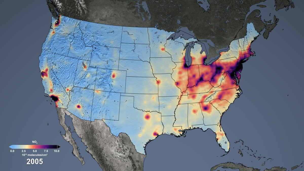
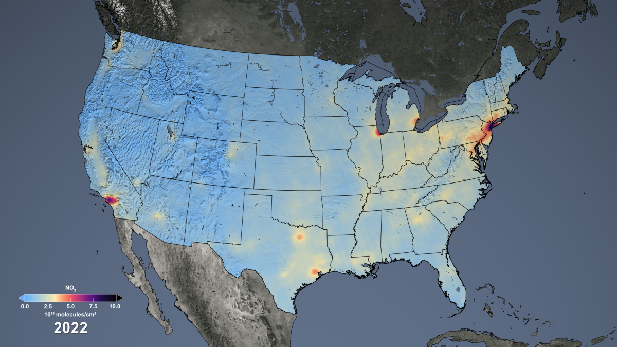


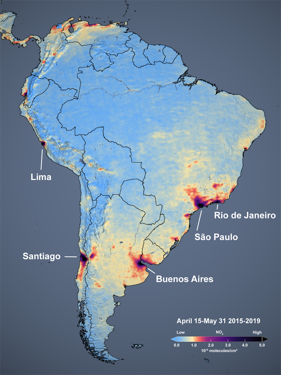
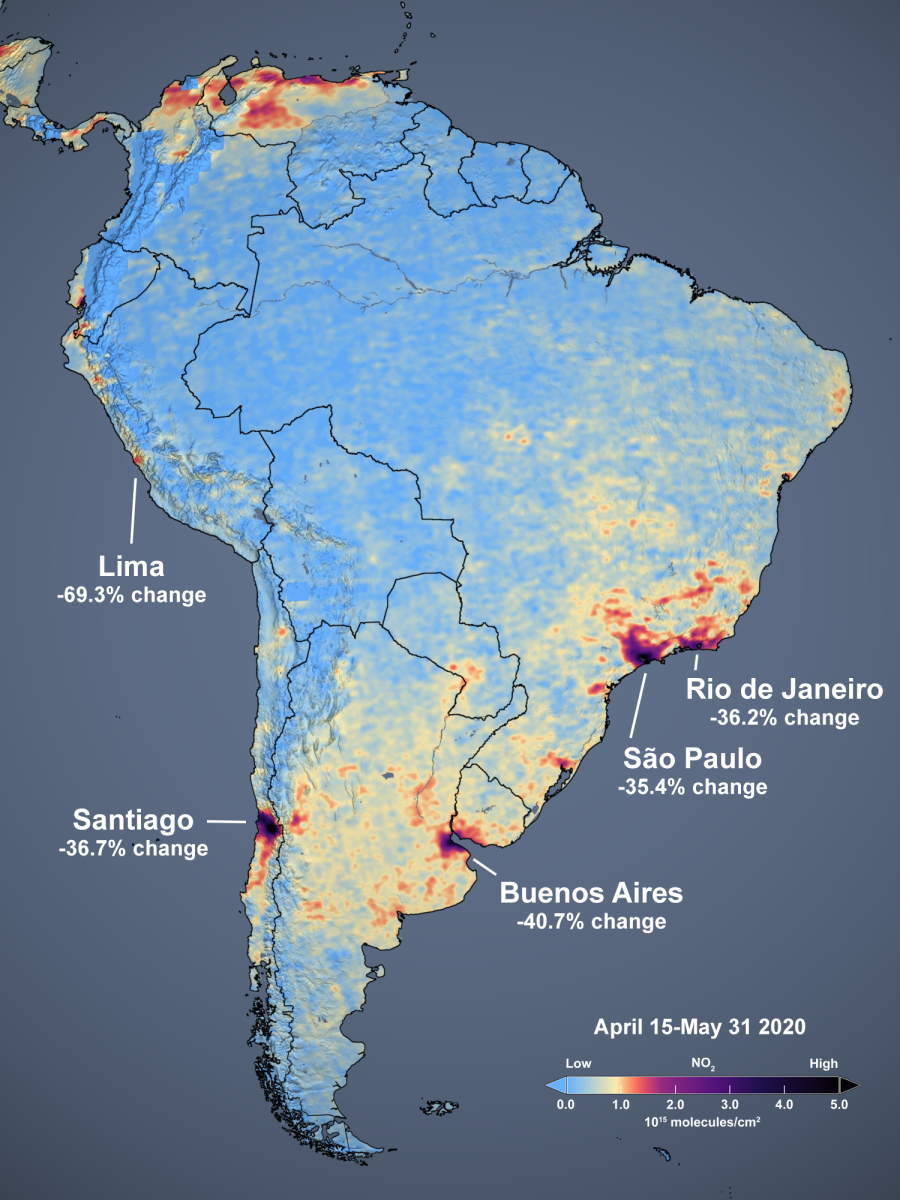
Figure caption: The slider above shows satellite estimates of NO2 from Aura’s Ozone Monitoring Instrument (OMI) as an average of April 15 through May 31 over South America. The image on the left shows the mean of the 230-day period from 2015 through 2019, while the image on the right shows the mean of the 46-day period for 2020. The sliders below show the same information, but zoomed to show five major South American cities. The images are free and publicly-available and may be downloaded.
Leyenda de la figura: el control deslizante de arriba muestra estimaciones satelitales de NO2 del Instrumento de Monitoreo de Ozono (OMI) de Aura, como un promedio del 15 de abril al 31 de mayo. La imagen de la izquierda muestrala media de un período de 230 días entre 2015 y 2019, y la imagen de la derecha muestra la media de un período de 46 días en 2020. Las imágenes son gratuitas, están disponibles públicamente y pueden descargarse en línea.
Legenda da Figura: O “controle deslizante” acima mostra estimativas de NO2 provenientes do Instrumento de Monitoramento de Ozônio (OMI) a bordo do satélite Aura, como uma média para o período de 15 de abril ate 31 de maio. A imagem à esquerda apresenta a média de 230 dias para o período entre os anos de 2015 até 2019, enquanto a imagem à direita mostra uma média de 46 dias para o mesmo período em 2020. Essas imagens estão disponíveis gratuitamente ao público e podem ser obtidas aqui.
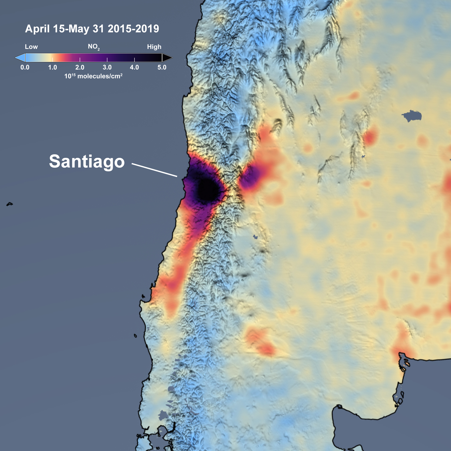
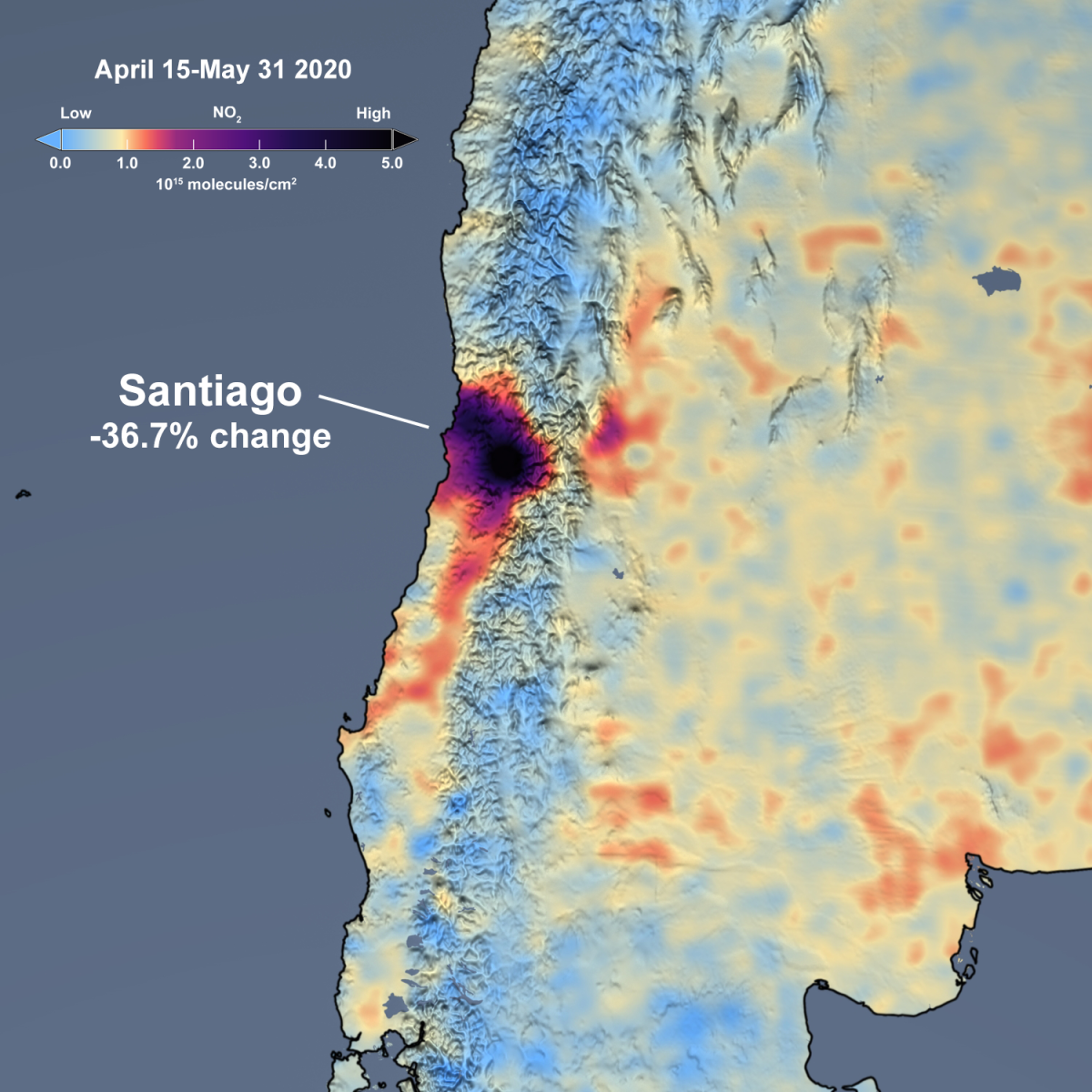
The slider above shows satellite estimates of NO2 from Aura’s Ozone Monitoring Instrument (OMI) as an average of April 15 through May 31. The image on the left shows the mean of the 230-day period from 2015 through 2019, while the image on the right shows the mean of the 46-day period for 2020.
NASA GSFC
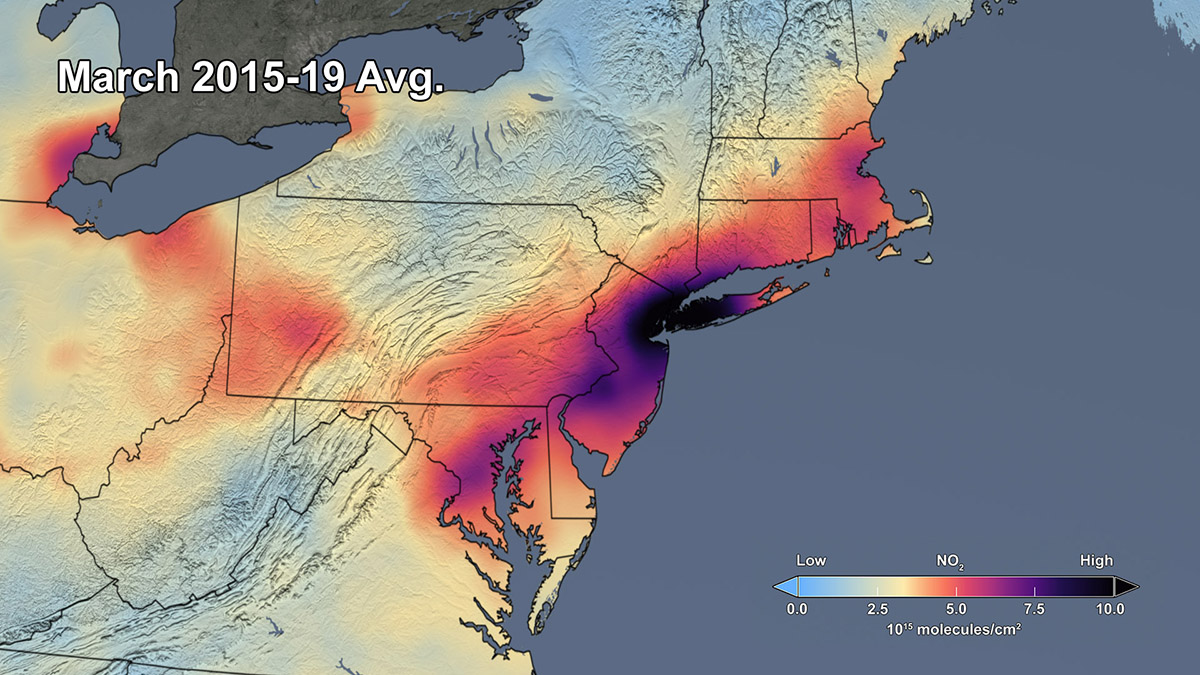
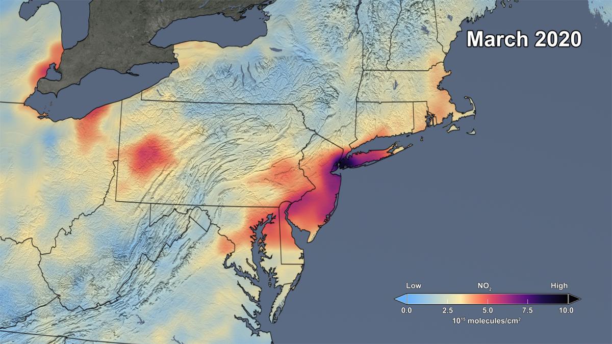
Over the past several weeks, the Northeast U.S. has seen significant reductions in air pollution over many of its major metropolitan areas, such as New York City and Baltimore. Similar reductions in air pollution have been observed across the globe. These recent improvements in air quality have come at a high cost, as communities grapple with the widespread stay-at-home advisories that began about a month ago as a result of the spread of COVID-19. The slider above shows satellite data of NO2 from the Aura Ozone Monitoring Instrument (OMI) over the Northeast United States in March. The image on the left shows the mean of the period from 2015 through 2019, while the image on the right shows the mean for 2020. Though variations in weather from year to year cause variations in the monthly means for individual years (see animation below), March 2020 shows the lowest values as compared to any of the monthly values for March during the OMI data record, which spans 2005 to present. In fact, the data indicate that the NO2 levels in March 2020 are about 30% lower on average across the region of the I-95 corridor from Washington, DC to Boston than when compared to the mean of 2015 to 2019. Caution: Further analysis is required to rigorously quantify the amount of the change in NO2 levels associated with changes in pollutant emissions versus natural variations in weather. The images are free and publicly-available and may be downloaded. NEW! For scientists: Global OMI NO2 Monitor.
NASA's Goddard Space Flight Center
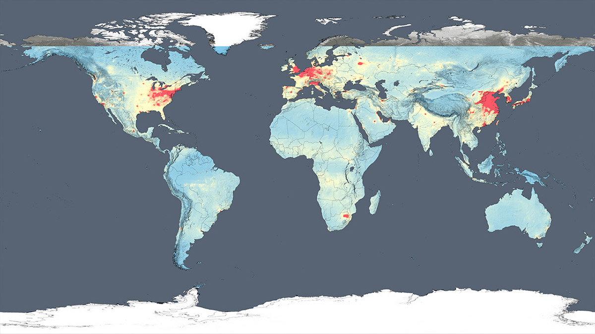
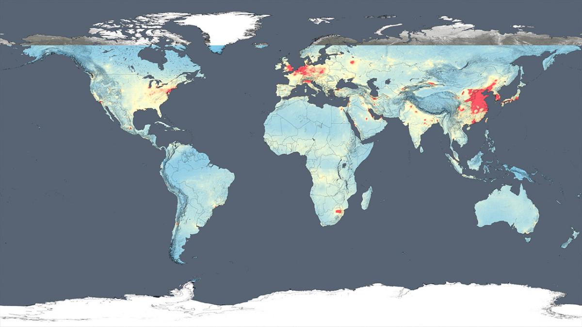
These global maps show NO2 levels in the atmosphere as detected by the Ozone Monitoring Instrument aboard the Aura satellite, averaged over 2005 and 2014, respectively.