
Smog in Shanghai, China

News

sa 2015 sa 2019

South America 2015-2019 vs 2020

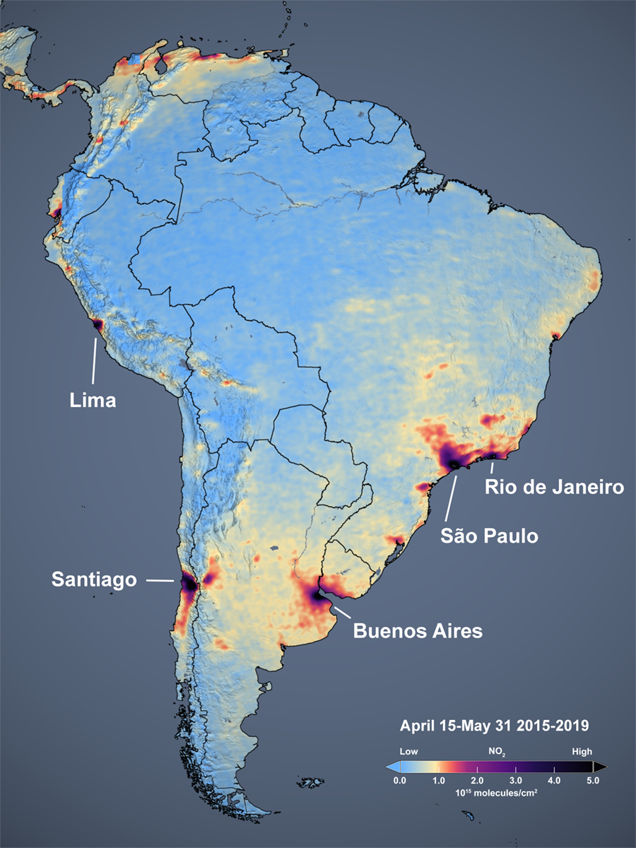
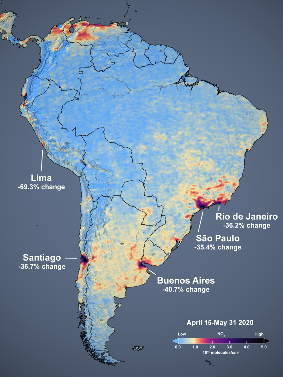
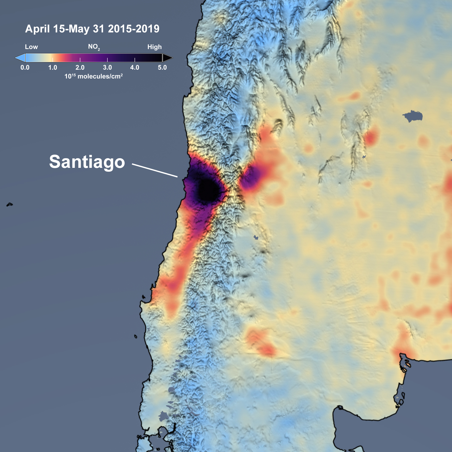
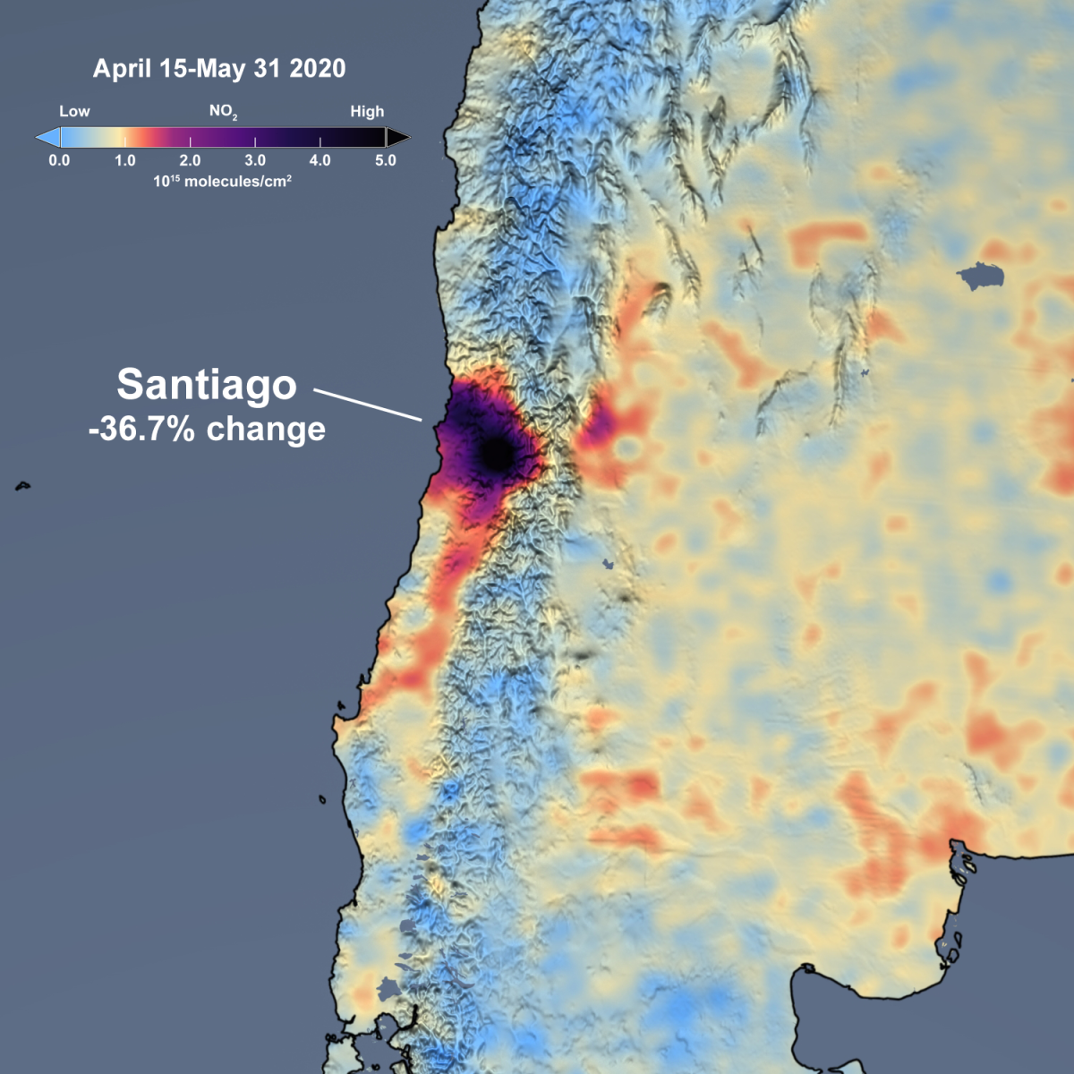
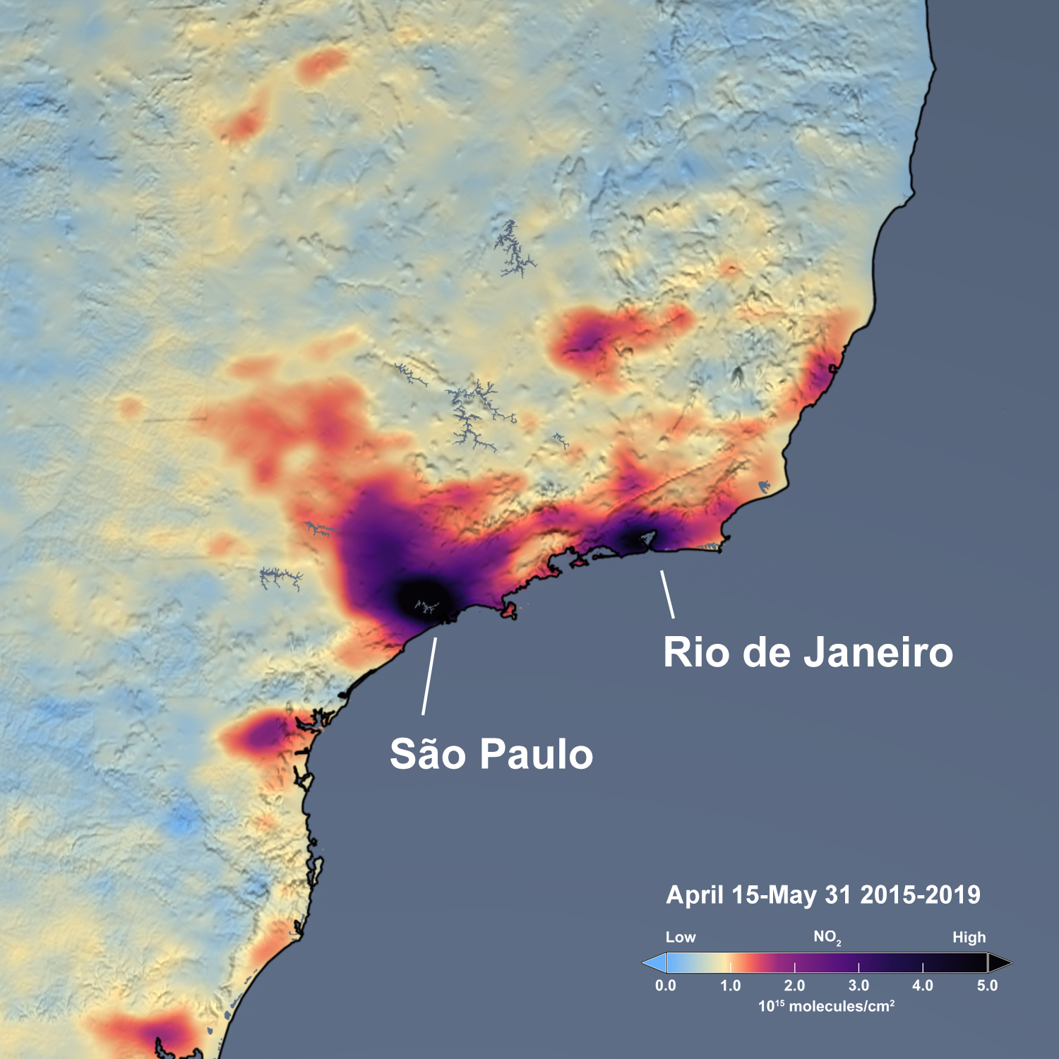
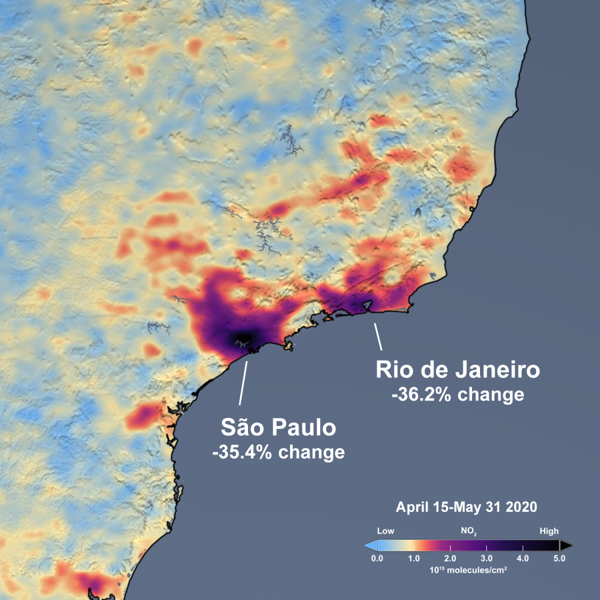
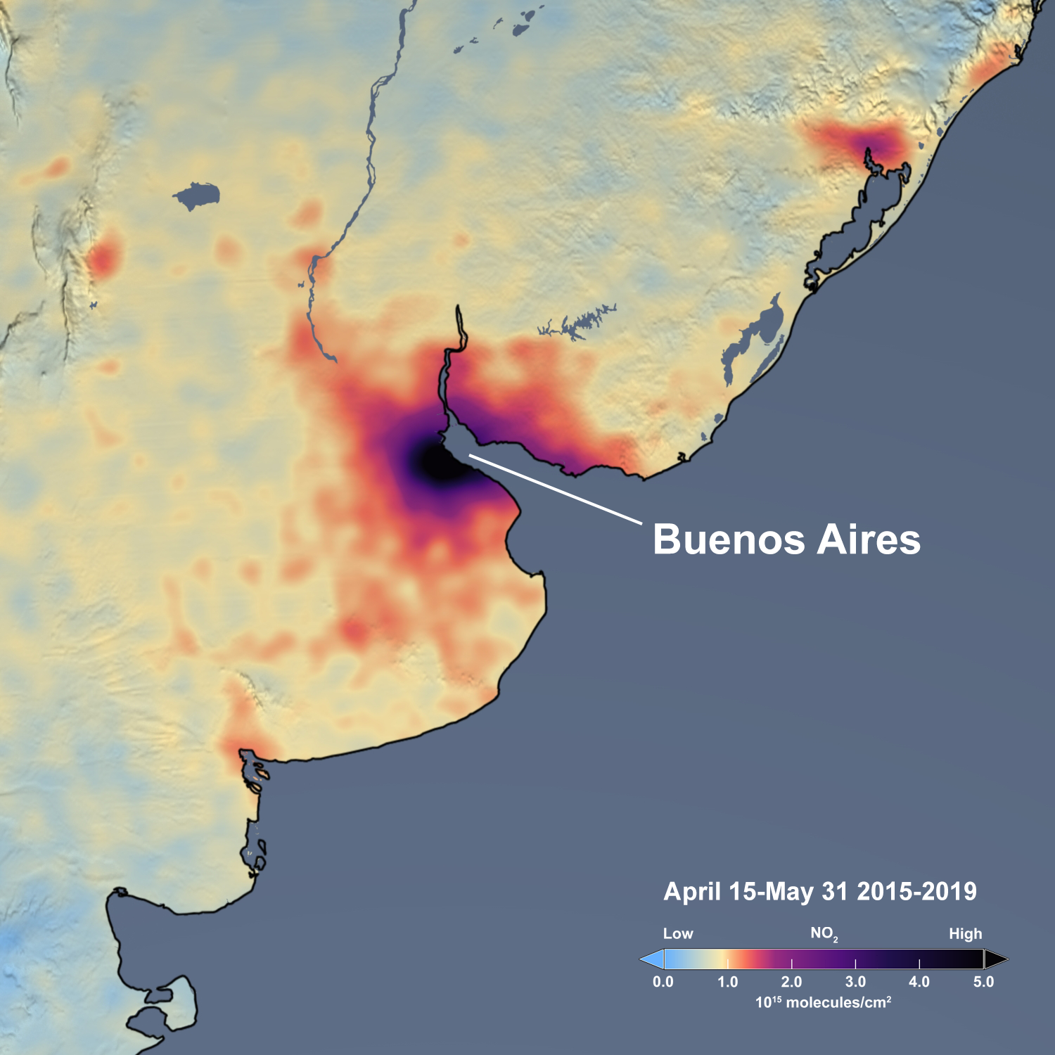
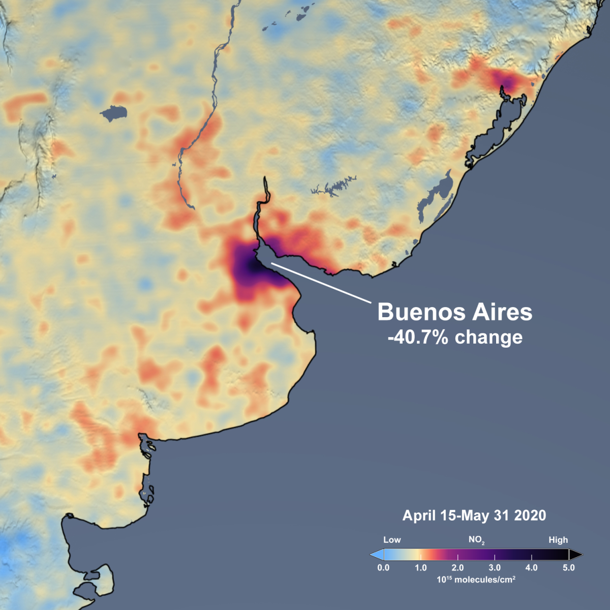
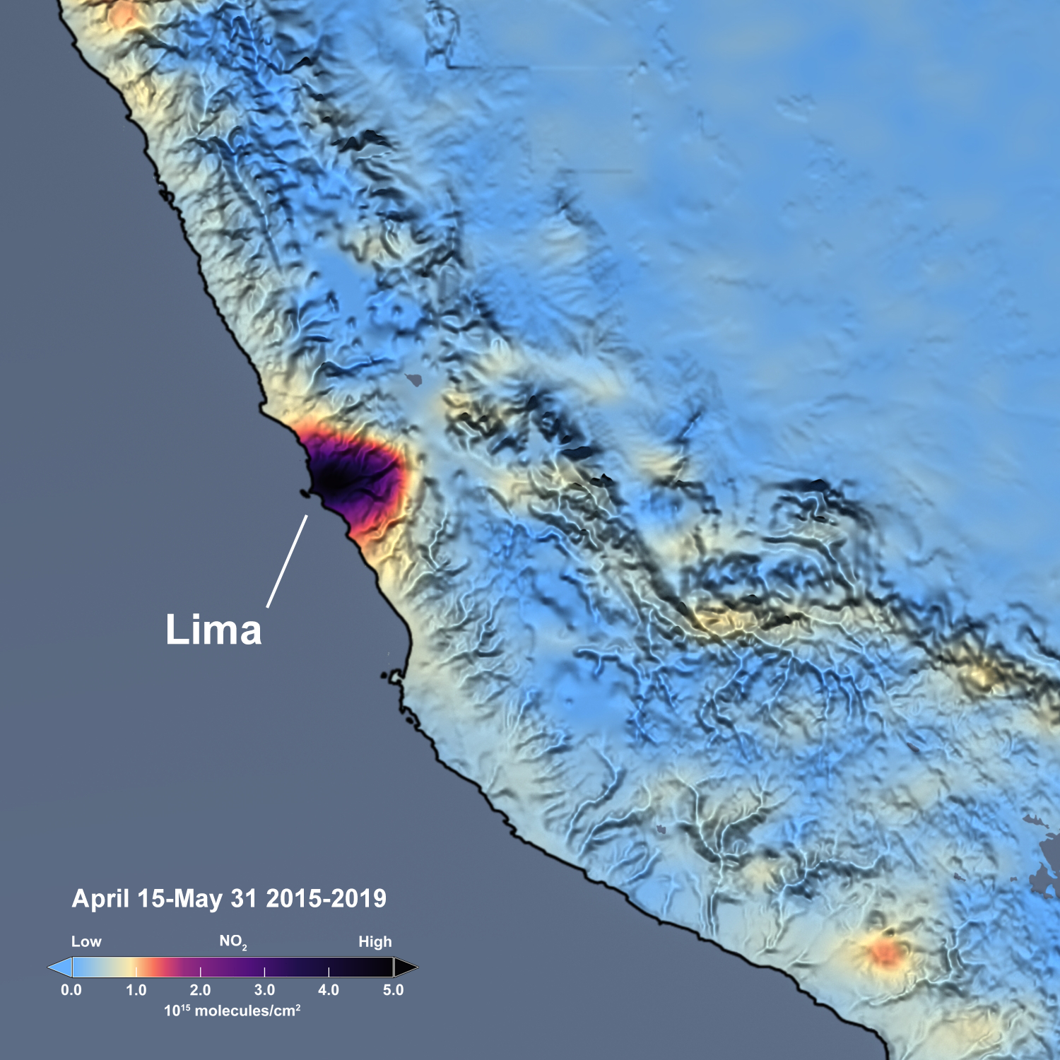
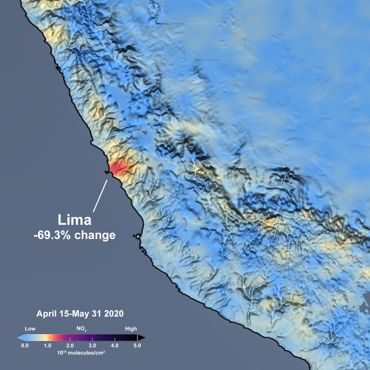
Figure caption: The slider above shows satellite estimates of NO2 from Aura’s Ozone Monitoring Instrument (OMI) as an average of April 15 through May 31 over South America. The image on the left shows the mean of the 230-day period from 2015 through 2019, while the image on the right shows the mean of the 46-day period for 2020. The sliders below show the same information, but zoomed to show five major South American cities. The images are free and publicly-available and may be downloaded.

Buenos Aires slider

Lima slider

Rio de Janeiro & São Paulo slider

Santiago slider

santiago 2015 santiago 2020

Santiago 2015-2019 vs 2020

The slider above shows satellite estimates of NO2 from Aura’s Ozone Monitoring Instrument (OMI) as an average of April 15 through May 31. The image on the left shows the mean of the 230-day period from 2015 through 2019, while the image on the right shows the mean of the 46-day period for 2020.

rio 2015 rio 2020

Rio de Janeiro 2015-2019 vs 2020

The slider above shows satellite estimates of NO2 from Aura’s Ozone Monitoring Instrument (OMI) as an average of April 15 through May 31. The image on the left shows the mean of the 230-day period from 2015 through 2019, while the image on the right shows the mean of the 46-day period for 2020.

buenos aires 2015 buenos aires 2020

Buenos Aires 2015-2019 vs 2020

The slider above shows satellite estimates of NO2 from Aura’s Ozone Monitoring Instrument (OMI) as an average of April 15 through May 31. The image on the left shows the mean of the 230-day period from 2015 through 2019, while the image on the right shows the mean of the 46-day period for 2020.

lima 2015 lima 2020

Lima 2015 vs 2020

The slider above shows satellite estimates of NO2 from Aura’s Ozone Monitoring Instrument (OMI) as an average of April 15 through May 31. The image on the left shows the mean of the 230-day period from 2015 through 2019, while the image on the right shows the mean of the 46-day period for 2020.

2017-2019 SO2 in India 2020 SO2 in India

OMI detected SO2 change over India after national lockdown

India recently became the world’s largest emitter of sulfur dioxide (SO2). The highest SO2 levels are over eastern India and primarily associated with electricity generation. Other sources in India include the ceramicsindustry.

LA 2015-19 LA 2020

Pandemic Before and After: Los Angeles 2015-2019 versus 2020

On March 19, California was one of the first states to set mandatory stay-at-home restrictions in an attempt to slow the spread of COVID-19. Arizona and Nevada followed suit around April 1.

Nitrogen Dioxide Levels Rebound in China

In early February 2020, scientists using NASA and European satellites detected a significant reduction in a key air pollutant over China after the country shut down transportation and much of its economy. Three months later, with most coronavirus (COVID-19) lockdowns ending in China and economic activity resuming, the levels of nitrogen dioxide over the country have returned to near normal for this time of year. Scientists expected this rebound.

india map 2017 india map 2020

Pandemic Before and After: South Asia: 2017-2019 versus 2020

On March 24, 2020, Prime Minister Modi ordered a nationwide stay-at-home order for India’s 1.3 billion citizens in an attempt to slow the spread of COVID-19.

SE 2015 SE 2020

Pandemic Before and After: Southeast US: 2015-2019 versus 2020

Over the past several weeks, the Southeast U.S. has seen significant reductions in air pollution over many of its major metropolitan areas, such as Atlanta and Charlotte. Similar reductions in air pollution have been observed in the Northeast U.S., Florida, and across the globe.