
Smog in Shanghai, China

Before/After Imagery

Pandemic Before and After: Los Angeles 2015-2019 versus 2020

LA 2015-19 LA 2020

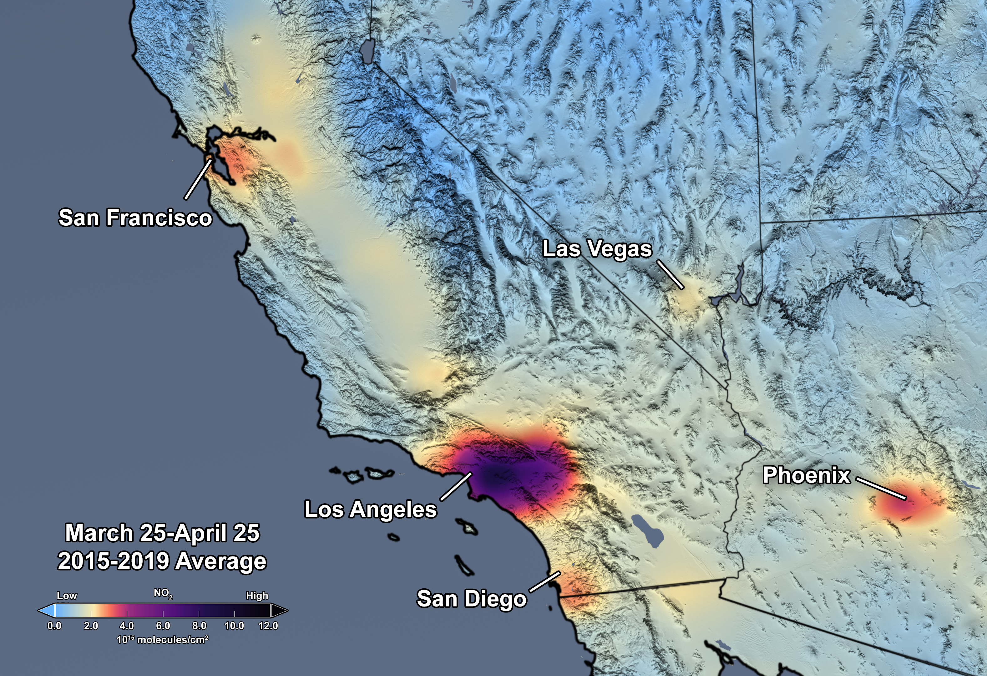
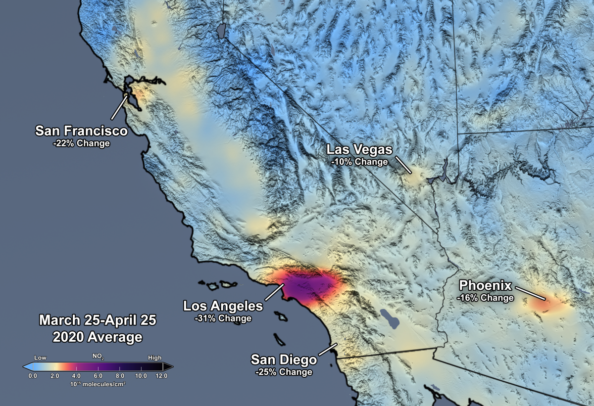
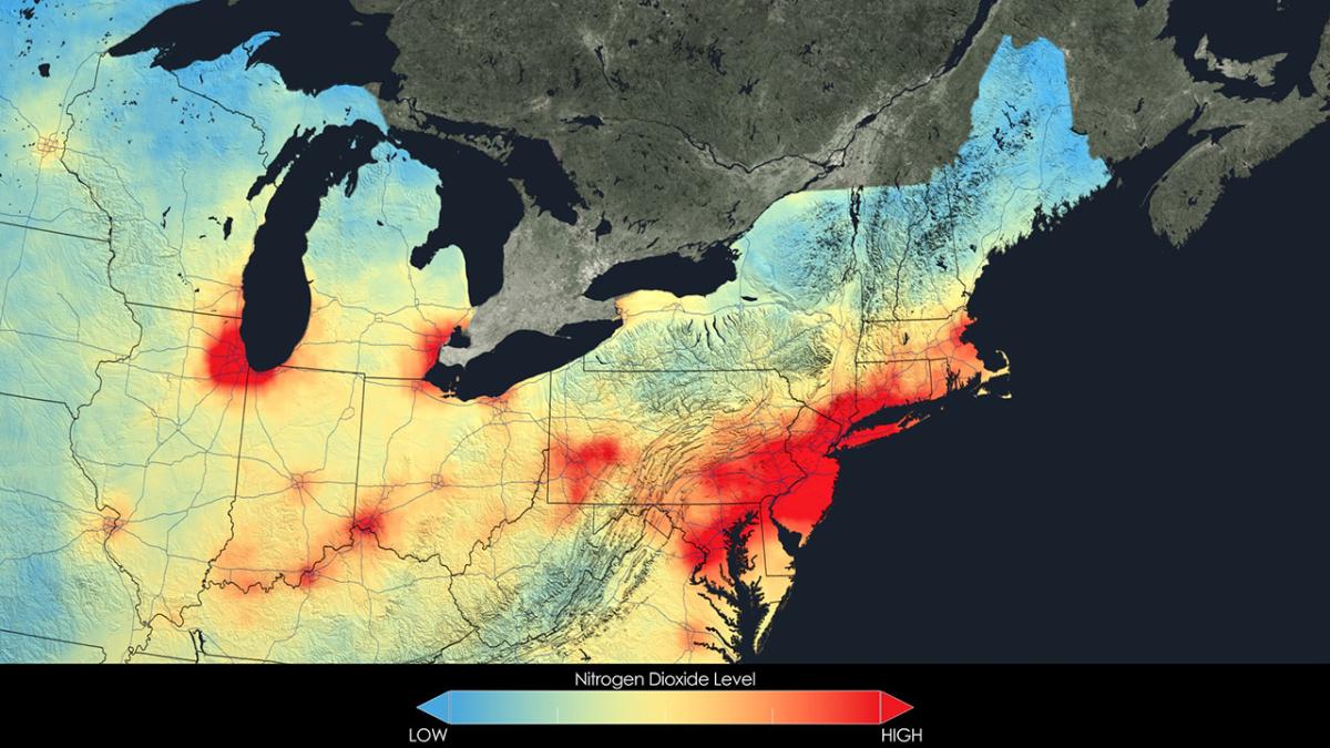
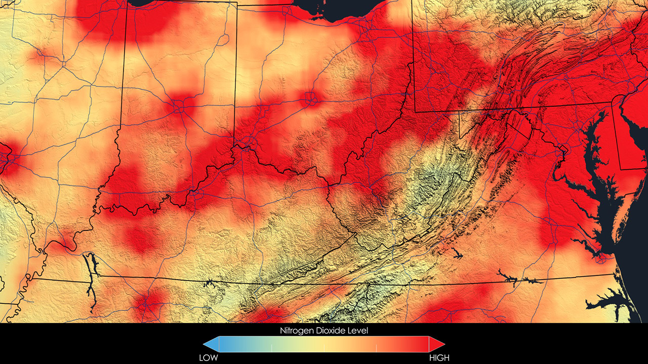
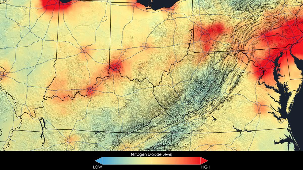
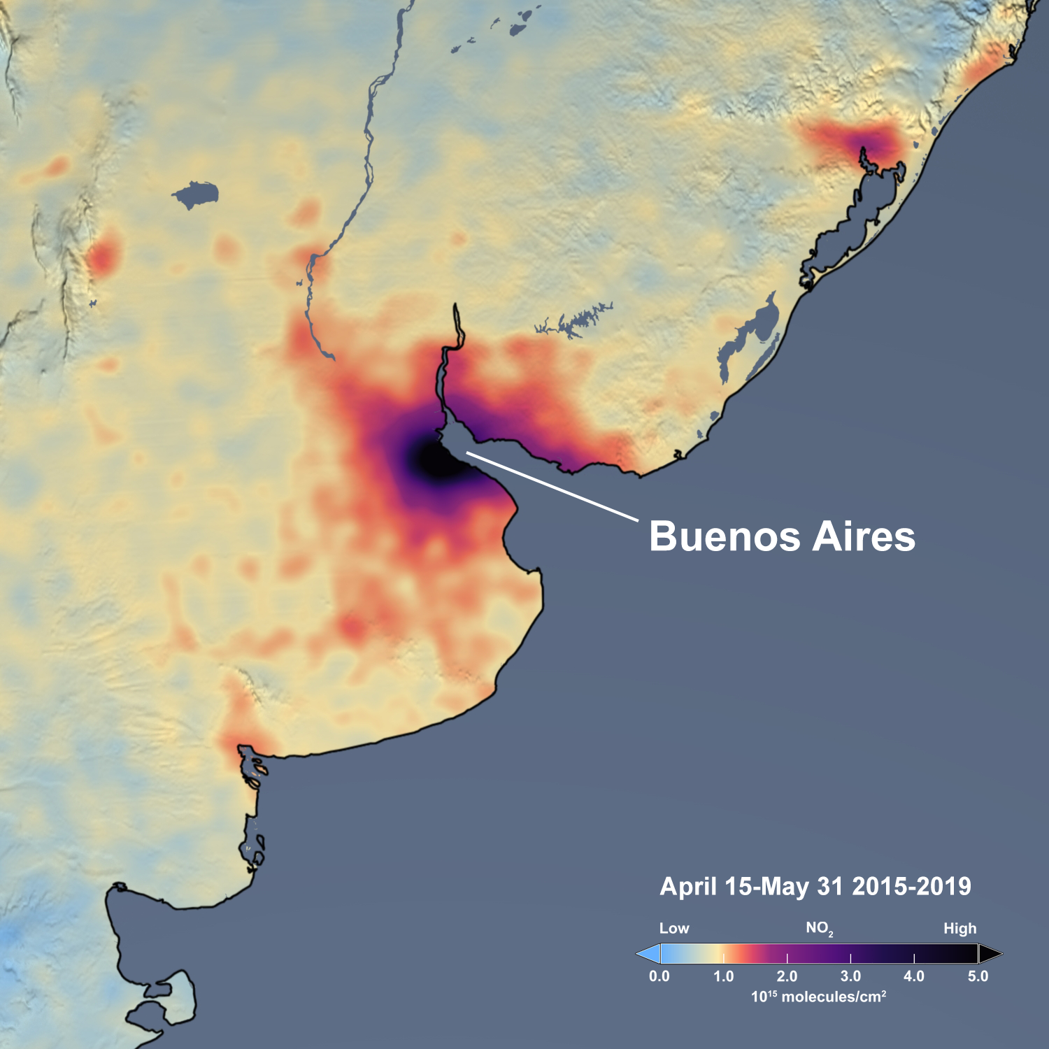
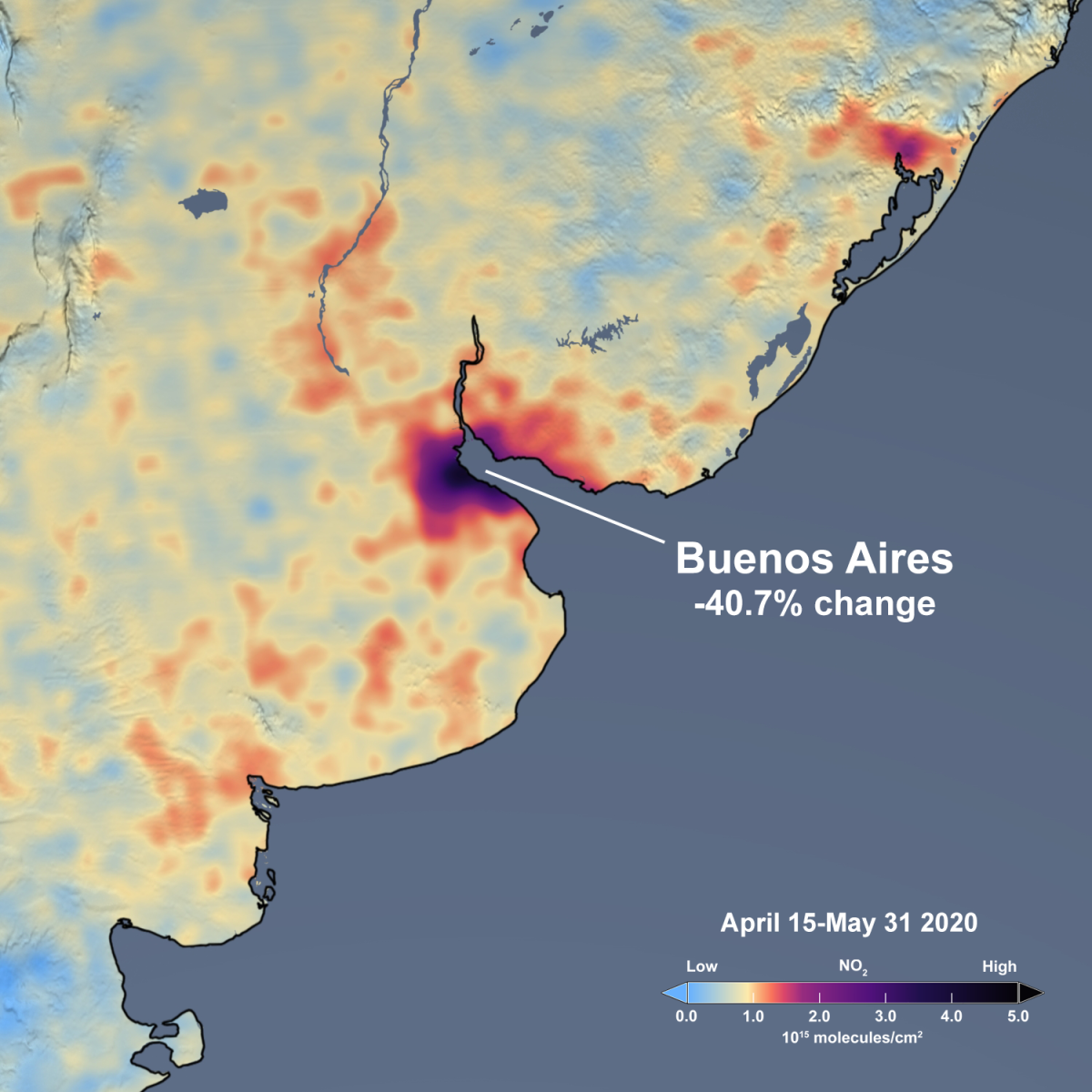
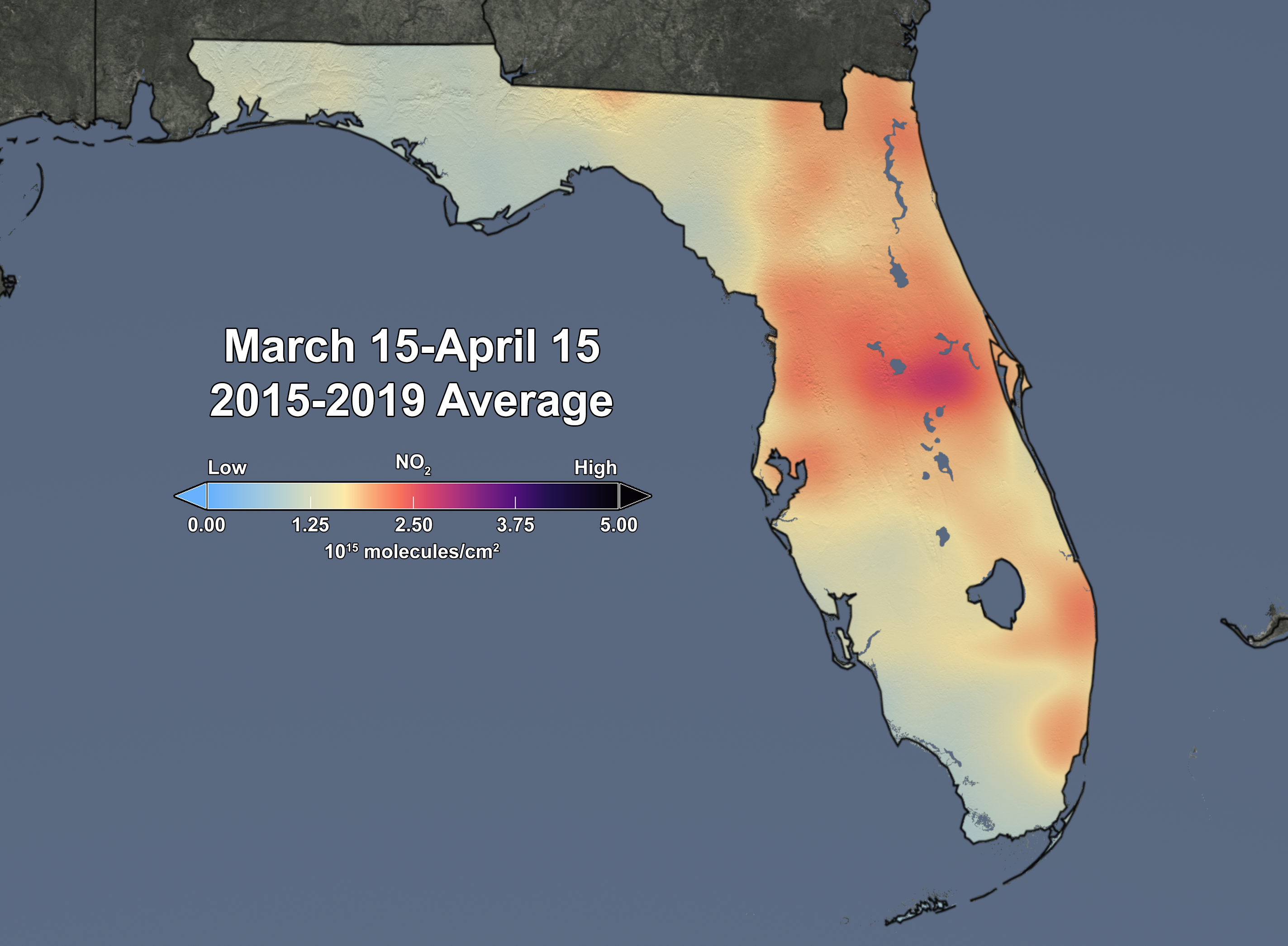
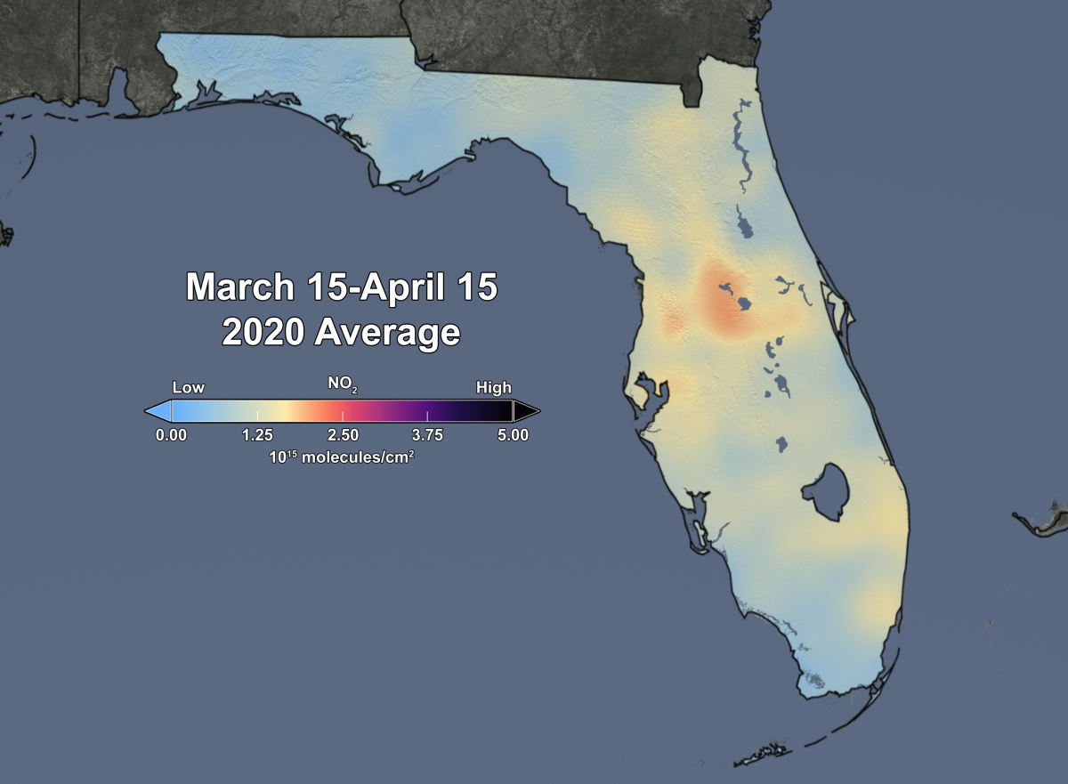
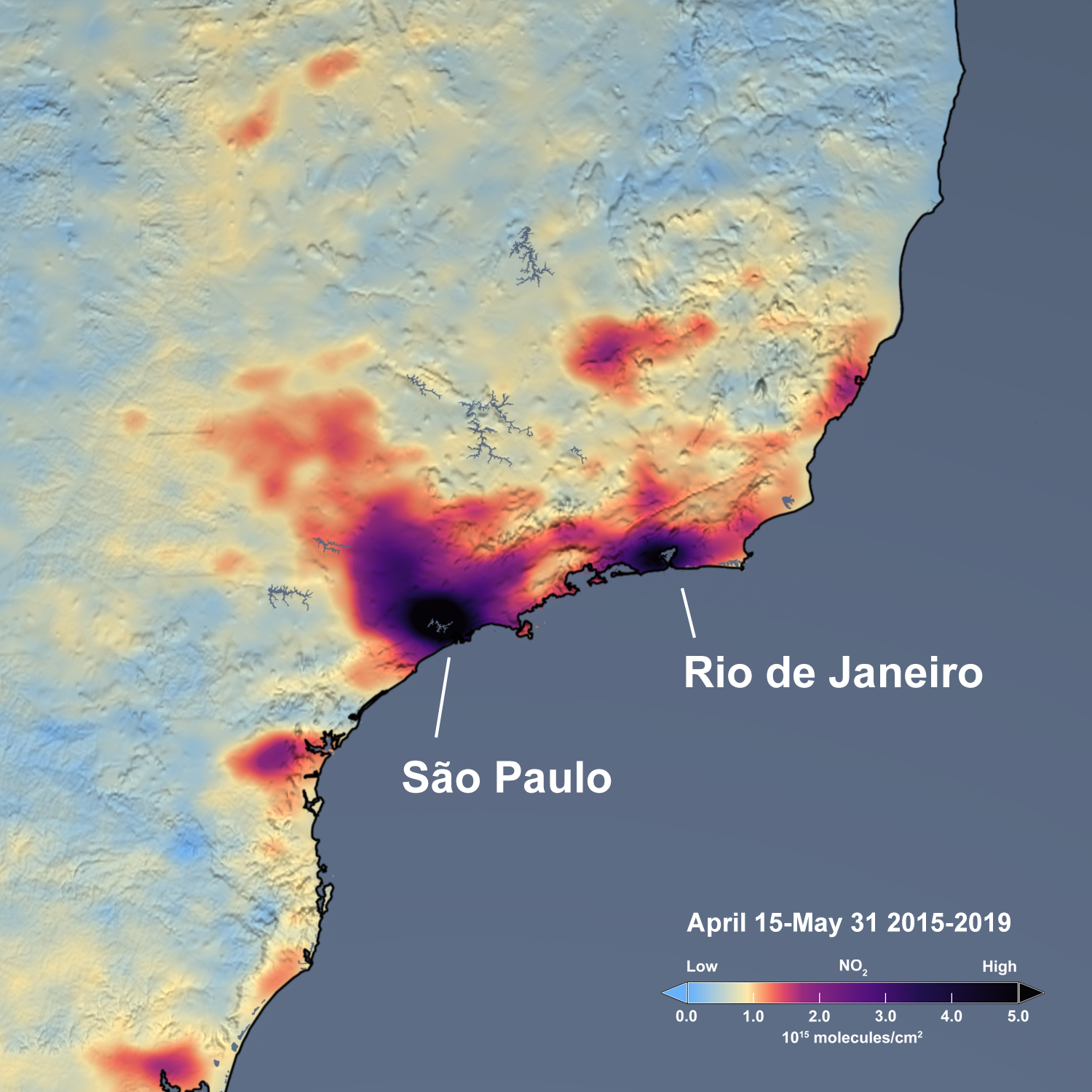
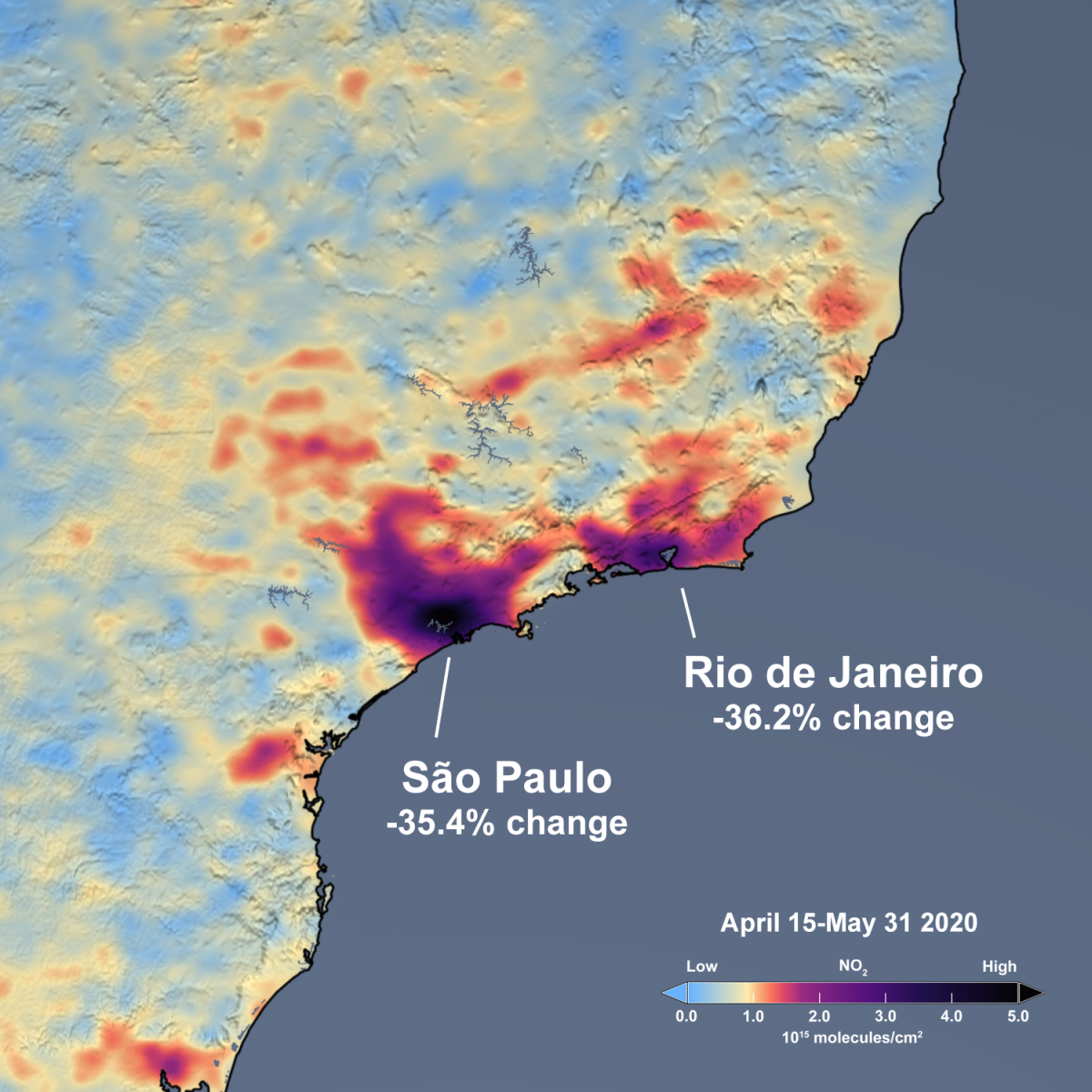
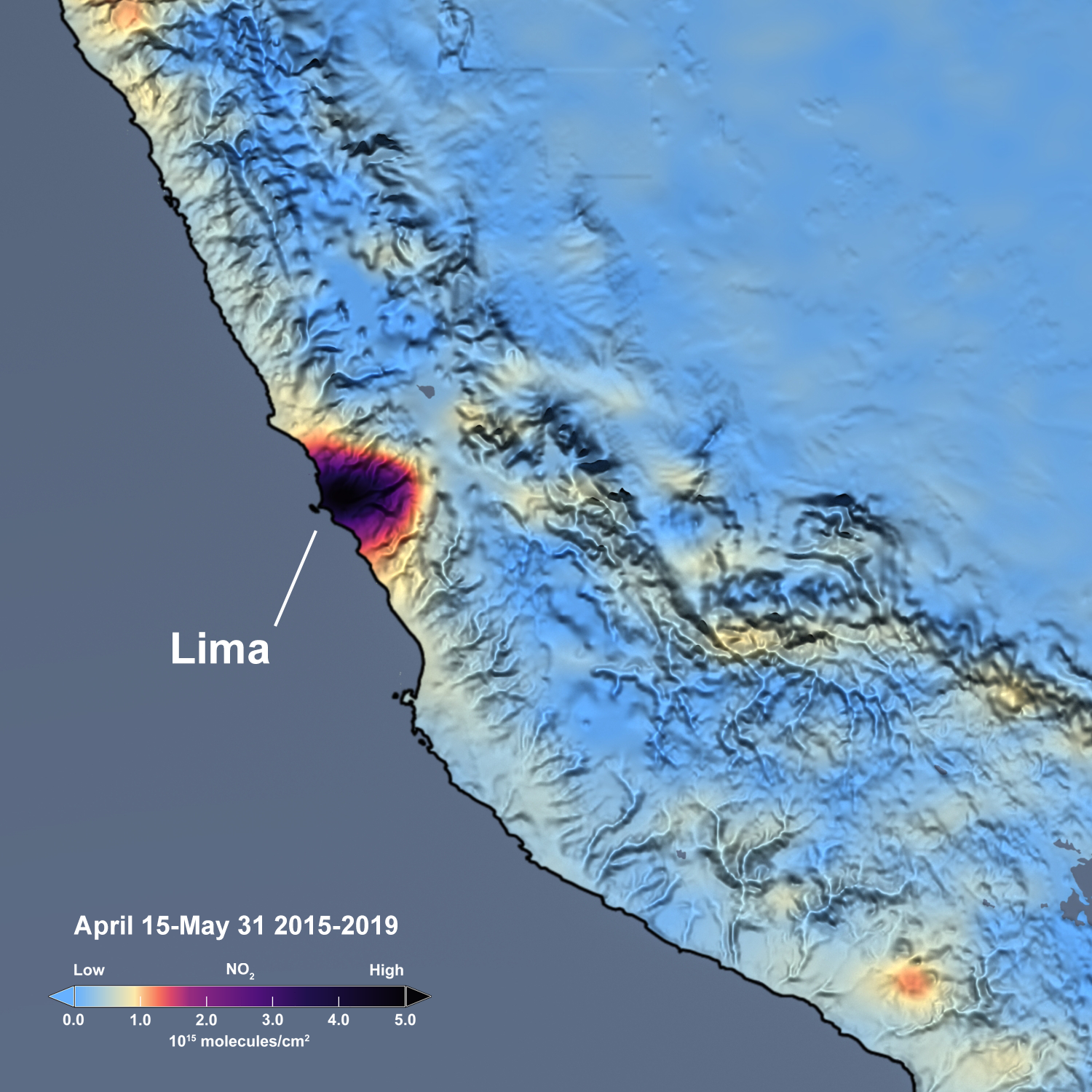
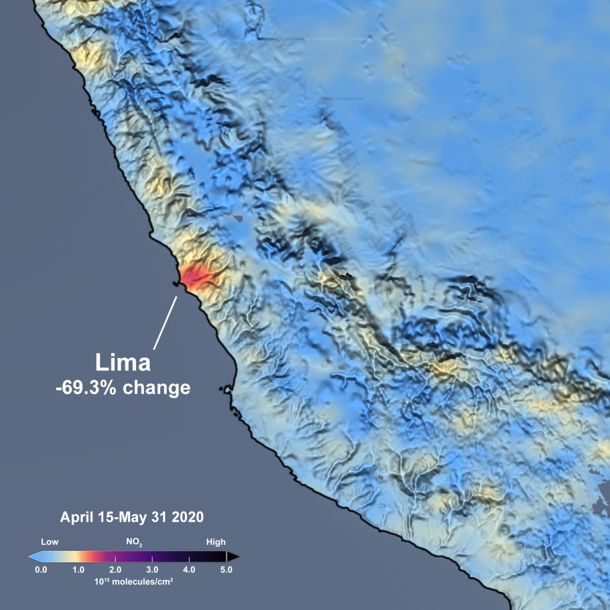
Figure caption: On March 19, California was one of the first states to set mandatory stay-at-home restrictions in an attempt to slow the spread of COVID-19. Arizona and Nevada followed suit around April 1. The Ozone Monitoring Instrument (OMI) on board NASA’s Aura satellite provide data that indicate that these restrictions have led to about a 31% decrease in NO2 levels in the Los Angeles basin relative to previous years. NO2, or nitrogen dioxide, is an air pollutant measured by OMI. The estimated reductions for other cities in the Southwest U.S. before and after the quarantine restrictions are 22% for the San Francisco Bay Area, 25% for San Diego and Tijuana, Mexico, 16% for Phoenix, and 10% for Las Vegas. The slider above shows satellite estimates of OMI NO2 as an average of March 25 through April 25. The image on the left shows the mean of the 150-day period from 2015 through 2019, while the image on the right shows the mean of the 30-day period for 2020. The images are free and publicly-available and may be downloaded.

Pandemic Before and After: Southeast US: 2015-2019 versus 2020

SE 2015 SE 2020

Figure caption: Over the past several weeks, the Southeast U.S. has seen significant reductions in air pollution over many of its major metropolitan areas, such as Atlanta and Charlotte. Similar reductions in air pollution have been observed in the Northeast U.S.Florida, and across the globe. These recent improvements in air quality have come at a high cost, as communities grapple with the widespread stay-at-home advisories that began about a month ago as a result of the spread of COVID-19. Governor Roy Cooper issued a statewide shelter-in-place order for North Carolina on March 27. Other Southeast states followed suit within about a week. The slider above shows satellite data of NO2 from the Aura Ozone Monitoring Instrument (OMI) over the Southeast U.S. as an average of March 15 through April 15. The image on the left shows the mean of the period from 2015 through 2019, while the image on the right shows the mean for 2020. Though variations in weather from year to year cause variations in the monthly means for individual years, the data indicate that the NO2 levels in the last month are about 40% lower over the Southeast U.S. when compared to the mean of 2015 to 2019. In fact, March 15 – April 15 2020 shows the lowest value for the region as compared to any other year during the OMI data record, which spans 2005 to present. The NO2 levels are about 40% lower over Atlanta, Savannah, and Charlotte. Caution: Further analysis is required to rigorously quantify the amount of the change in NO2 levels associated with changes in pollutant emissions versus natural variations in weather. The images are free and publicly-available and may be downloadedNEW! For technical expertsGlobal OMI NO2 Monitor.

Pandemic Before and After: South Asia: 2017-2019 versus 2020

india map 2017 india map 2020

Figure caption: On March 24, 2020, Prime Minister Modi ordered a nationwide stay-at-home order for India’s 1.3 billion citizens in an attempt to slow the spread of COVID-19. As a consequence, less fossil fuels are being consumed and, subsequently, less air pollution is being emitted in India and also in neighboring countries, including Pakistan, Nepal, Bangladesh, and Sri Lanka. The slider above shows satellite data of NO2 from the Aura Ozone Monitoring Instrument (OMI) as an average of March 25 through April 25. The image on the left shows the mean of the period from 2017 through 2019, while the image on the right shows the mean for 2020. The slider shows that widespread decreases (~30-60%) in NO2 levels have occurred over most of South Asia. For instance NO2 levels decreased by about 45% in Lahore, Pakistan, 45% in Dhaka, and 55% in Delhi, India. The highest NO2 levels that remain in South Asia are located in eastern India and are primarily associated with electricity generation by thermal power plants. The images are free and publicly-available and may be downloaded.

Before and After: US East Coast 2005-2011

Northeast Air Quality, 2005. Northeast Air Quality, 2011.

NASA Goddard's Scientific Visualization Studio/T. Schindler.

Pollution builds up along the U.S. East Coast as it passes from one city to the next, particularly in the Northeast Corridor. These cities include Richmond, Washington, Baltimore, Philadelphia, New York City, Boston and all the smaller cities in between. Some of the largest absolute changes in nitrogen dioxide have occurred in this corridor.

Before and After: Ohio Valley 2005-2011

Image showing Air Quality in the Ohio Valley, 2005. Image showing Air Quality in the Ohio Valley, 2011.

NASA Goddard's Scientific Visualization Studio/T. Schindler.

The impact of technology to reduce emissions of nitrogen dioxide and sulfur dioxide from coal-fired power plants is apparent in satellite imagery, which shows the signal of pollution blink out over time. Still, while air quality is improving, power plant emissions of carbon dioxide – a greenhouse gas – remain an issue.

OMI detected SO2 change over India after national lockdown

2017-2019 SO2 in India 2020 SO2 in India

NASA GSFC

Figure caption: India recently became the world’s largest emitter of sulfur dioxide (SO2). The highest SO2 levels are over eastern India and primarily associated with electricity generation. Other sources in India include the ceramicsindustry. The slider above shows satellite data of SO2 from Aura’s Ozone Monitoring Instrument (OMI), averaging levels between March 25 and April 25. The image on the left shows the mean SO2 levels for 2017-2019, while the image on the right shows the mean for 2020. The decrease in SO2 levels in 2020 mostly reflect decreased power generation, likely attributed to the shuttering of businesses during India’s stay-at-home order. Independent estimates indicate that electricity generation for India was down about 10% and 25% in March and April 2020, respectively, as compared to March and April 2019. Another pollutant, NO2, is also emitted during thermal power generation and also showed a decrease in 2020relative to previous years. One exception for SO2 is in southern India and it could be related to increased thermal power generation that came on line before the stay-at-home order. However, NO2 appears to not have had a similar increase over the area. More analysis is required to understand the cause. The images are free and publicly-available and may be downloaded.

Buenos Aires 2015-2019 vs 2020

buenos aires 2015 buenos aires 2020

The slider above shows satellite estimates of NO2 from Aura’s Ozone Monitoring Instrument (OMI) as an average of April 15 through May 31. The image on the left shows the mean of the 230-day period from 2015 through 2019, while the image on the right shows the mean of the 46-day period for 2020.

Pandemic Before and After: Florida 2015-2019 versus 2020

florida2015-2019 florida2020

Figure caption: Over the past several weeks, Florida has seen significant reductions in air pollution over many of its major metropolitan areas, such as Miami and Orlando. Similar reductions in air pollution have been observed across the globe. These recent improvements in air quality have come at a high cost, as communities grapple with the widespread stay-at-home advisories that began about a month ago as a result of the spread of COVID-19. Major League Baseball (MLB) spring training games were canceled on March 12 and Disney World in Orlando closed on March 16. Bars and nightclubs were shuttered on March 17 by an executive order from Governor DeSantis of Florida. Many “Snowbirds”, people from the northern U.S. and Canada who spend winter in Florida, began heading back north earlier than normal. The slider above shows satellite data of NO2 from the Aura Ozone Monitoring Instrument (OMI) over Florida as an average of March 15 through April 15. The image on the left shows the mean of the period from 2015 through 2019, while the image on the right shows the mean for 2020. Though variations in weather from year to year cause variations in the monthly means for individual years, the data indicate that the NO2 levels in the last month are about 30% lower over the Florida Peninsula when compared to the mean of 2015 to 2019. In fact, March 15 – April 15 2020 shows the lowest value for the region as compared to any other year during the OMI data record, which spans 2005 to present. The NO2levels are about 30-35% lower over Orlando and Miami, while about 40% lower over Jacksonville. Caution: During much of this time period, central and south Florida experienced record setting heat and unusually low rainfall. Therefore, further analysis is required to rigorously quantify the amount of the change in NO2 levels associated with changes in pollutant emissions versus natural variations in weather. The images are free and publicly-available and may be downloadedNEW! For scientistsGlobal OMI NO2 Monitor.

Rio de Janeiro 2015-2019 vs 2020

rio 2015 rio 2020

The slider above shows satellite estimates of NO2 from Aura’s Ozone Monitoring Instrument (OMI) as an average of April 15 through May 31. The image on the left shows the mean of the 230-day period from 2015 through 2019, while the image on the right shows the mean of the 46-day period for 2020.

Lima 2015 vs 2020

lima 2015 lima 2020

The slider above shows satellite estimates of NO2 from Aura’s Ozone Monitoring Instrument (OMI) as an average of April 15 through May 31. The image on the left shows the mean of the 230-day period from 2015 through 2019, while the image on the right shows the mean of the 46-day period for 2020.